Screen printing has never been a fan of me, nor I it.
I found it quite difficult to mix the dyes for screen printing as it was difficult to alter the colour once you had already ‘completed’ the mixing process. On the first day, we were dying onto plain white silk, I chose a yellow, a dark orange/red and a blue. These colours were taken from my box clever project and my swatchbook. Within my box, I have generally selected these colours to work from as they were the ones that stood out to me from the two tone fabrics, the orange netting and the red knit. I tried to get as close to the colours as possible but they printed out much weaker than I first imagined. This gave the yellow and the blue quite a pale complexion, despite the strength of the colours within my box. The red however presented quite well as a combination between the orange and the reds taken from my projects.
My two first prints came out quite clearly which is rare within my previous messy experiences. However, they were quite basic due to the white background, along with the lack of strength to the dyes I had chosen, making the pieces unable to reflect the true nature of the colours within my box.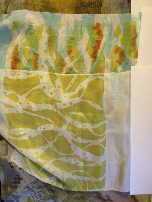
My third print was more similar to my previous experiences, turning out a bit of a mess. Due to the basic nature of my first pieces I overcompensated by experimenting a bit too much. I selected the red dye once I had decided the others were too weak. Then, referencing my work, I decided to twist a piece of fabric to reflect the twisting nature of the red yarn within my box that I have used for inspiration throughout. I then dipped this into the dye and tried to represent this twisting design onto my silk. However, the dye was too thick and the grain of the fabric was lost, creating more of a red splodge. Trying to resurrect this I painted into the design but it was not saved. If I was to do this again, I would create a tighter twist within the fabric and use less dye, possibly slightly weak, so as to grasp the fabrics pleats.
The second day of printing wasn’t much better than the first. Having vat dyed the silk a few days before, I was able to use these pieces to screen print on. I was actually really happy with the outcome of the fabric having been vat dyed. I had chosen a mustard and blue fade dye, with a touch of reds added in throughout. I also sampled using grey to dull and darken out tones, which helped the colours to be specific to my box.
I spent more time mixing the colours today for screen printing and was able to get similar shades and tones to the desired swatch, including a dark mustard and a dark blue. I was hoping these would show up on the already dyed fabric.
Actually liking the dyed pieces added a little bit more pressure to the screen printing phase, which I wasn’t very confident on anyway. My first experimentation, having not learnt from the day before, involved placing yarn onto the screen before adding dye, as a way of blocking out that area for negative space. I placed the dye in a looping fashion to represent the drawings within my swatchbook inspired by my knitted piece from the box. When I placed the screen onto the silk, the negative space wasn’t held very well and the dye interfered, creating another mess. Again, I tried to resurrect the piece but failed in doing so, possibly even making it worse. I recognised that the dark mustard wasn’t very strong in tone on the silk as it was too similar to the colours already present.
However, upon later reflection, I quite like the similarity between the dyes and the silk colour due to being more subtle, which is my type of working anyway. If the designs had been better then the dye wouldn’t have turned out as bad.
![IMG_3374[1].JPG](https://tillybblog.wordpress.com/wp-content/uploads/2017/01/img_33741.jpg?w=561&h=421)
The rest of my pieces continued along this quite negative path, until I decided to stop experimenting and try something more basic. I thought maybe the interference of the fade dye on the background could be making the patterns look too busy. Finally, I picked up a useful stencil, rather than trying to adapt the existing ones. The plain stencils created a cleaner print and did look more like the intended outcome, however, I was not happy with the mundane nature of them.
If I was to do this again then I would use more refined stencils. The best outcomes of the day were the prints that involved quite a small detailed design which could be built upon. I liked the effect of the net which I used to dye through, creating the small square designs. If I had planned the printing better then I would have had more structure to my printing on the day rather than ‘playing’.
The difficult part of my printing process was that I really liked the silk after vat dyeing and didn’t really want to print on top of it. I think I would created a weaker background dye if I had known how hesitant I would be. The strength of the background dye also puts focus on the print on top, drawing more attention to the messy part of the fabric.
